UC Riverside Library
Simplifying a content heavy site
UC Riverside Library had a legacy site with over 210 navigation items. The site suffered from redundant content, dead links, and confusing navigation. I worked with their team of 17 librarians to rebuild the site from scratch. We began by creating a new site map that was 38% smaller.
I facilitated 8 days of ux workshops where we defined the structure of the new site.
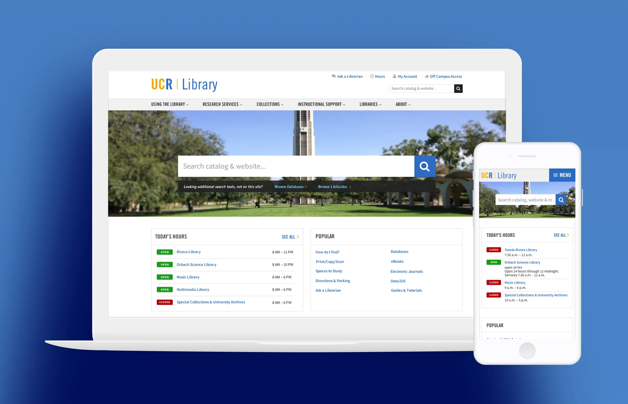
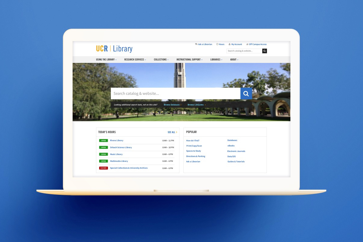
Search was the number one task users wanted to do on the site. For this reason, we featured it prominently on the home page.
We needed to show search results from multiple sources. I added labels and off-site link icons to reassure users where the links would take them.
Users needed to find library hours quickly. I added a link in the utility navigation for faster access. The hours page shows unique information for 5 different libraries.
Each library has its own section where it can display its unique resources and services.
The site size required a mobile menu design that went 4 levels deep. I included the search field at the top of the menu to support this high priority task.
Collections are a unique differentiator of the UCR Library. We kept them as a link in the primary navigation. I created new designs for the landing and detail pages, reflecting the new taxonomies and content structure.
I designed a new news section to give UCR Library a better way to communicate with its users.
To accommodate the library's need to host workshops and events, I designed an events section. It allows users to RSVP and shows multiple dates.
Results
The new UC Riverside Library website displays on all screen sizes and is easier to use.
Highlights
- Reduced site map size by 38%
- Facilitated ux workshops with 17 participants
- Eliminated redundant content
- Extended UC Riverside digital appearance to accommodate responsive design requirements
- Improved user experience
Services
- Strategy
- Creative direction
- Workshop facilitation
- Content strategy
- Information architecture
- User experience design
- Responsive design
- Brand extension
This project was done at Chapter Three.

