CKR Interactive
The refresh of a brand
I worked at CKR Interactive as an Art Director. During my time there, I redesigned their website and updated their brand.
Who is CKR Interactive?
CKR Interactive is a recruitment marketing agency. They specialize in partnering with mid-level enterprise clients. They help them activate their brands to attract top-level talent in hard to fill positions. CKR has been around for 15 years and has a talented team of seasoned professionals.
The design challenge
CKR needed a new website to better communicate their core services. Their capabilities had grown over the years, but their site was failing to show that.
We set out to design a site that generated more leads and communicated the company’s strengths. We defined our goals as follows:
Improve lead generation by 30% for target clients
Improve understanding of key services
Position CKR as a thought leader in market sector
Communicate differentiation
Improve brand awareness
The design solution
To meet this challenge, I set out to modernize the brand and make every page on the site work towards the goals. Some of the tactics included:
Adding calls to action on every page
Adding contextual calls to action
Adding lower level engagement options for users in the research phase
Creating a professional, smart, sophisticated, fun and friendly look and feel
Extending the brand visual language
Updating the logo
The logo did not need a full redesign. Given our goals, the logo itself did not represent the biggest design challenge. I did a minor update to enable the logo to better match the new design. I modified the type treatment to feel more modern and clean, and changed the color to match the new palette.
Typography
The existing brand used Roboto and Museo. While Roboto is easy to read and versatile, Museo was failing to convey the right tone. It looked friendly, but did not feel sophisticated and professional. Raleway replaced Museo, serving as the typeface for the headers. It’s elegant and geometric. It has subtle curves that can be appreciated at larger sizes.
Visual exploration
CKR is a fun company. Its employees are smart, innovative and hard-working. I wanted to extend the visual language to support the vitality of this organization.
As a starting point, I created some pattern concepts. These became the visual building blocks for the iconography and design concept. The patterns ended up being used sparingly, but they influenced the design thinking throughout the brand.
Iconography
To help unify company communication, I designed an icon system. The system is built to be extended over time as new communication needs arise. Many of the shapes from the pattern exploration serve as the building blocks for the icons.
Showcasing the team
CKR’s greatest asset is its team. We needed to show them in a visually united way. I gathered head shots, cut them out and exported each person against 5 different colored backgrounds. These visual assets were immediately useful to everyone needing to create presentations for new or existing clients.
Website design
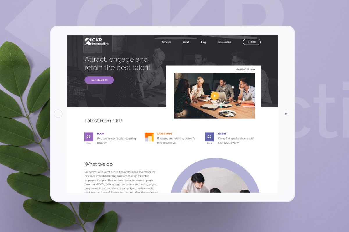
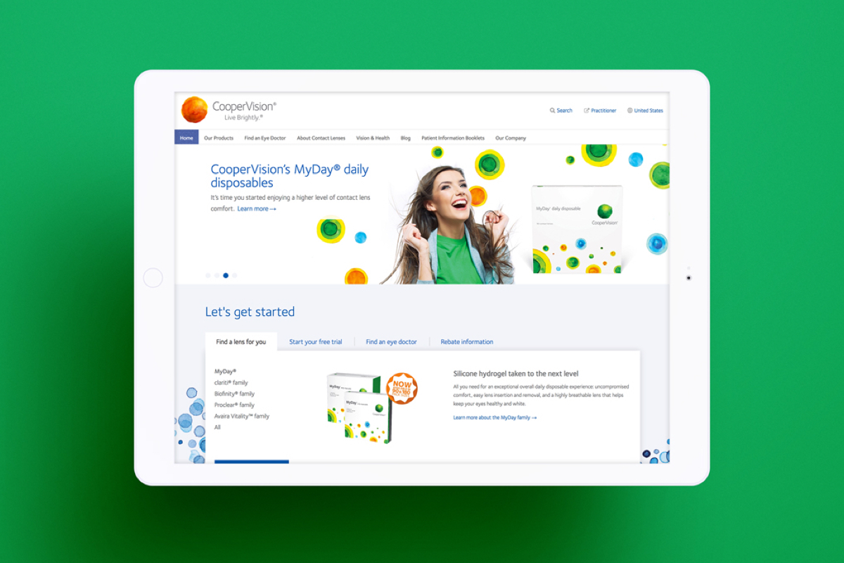
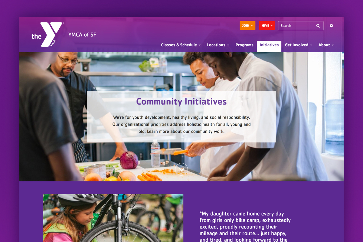
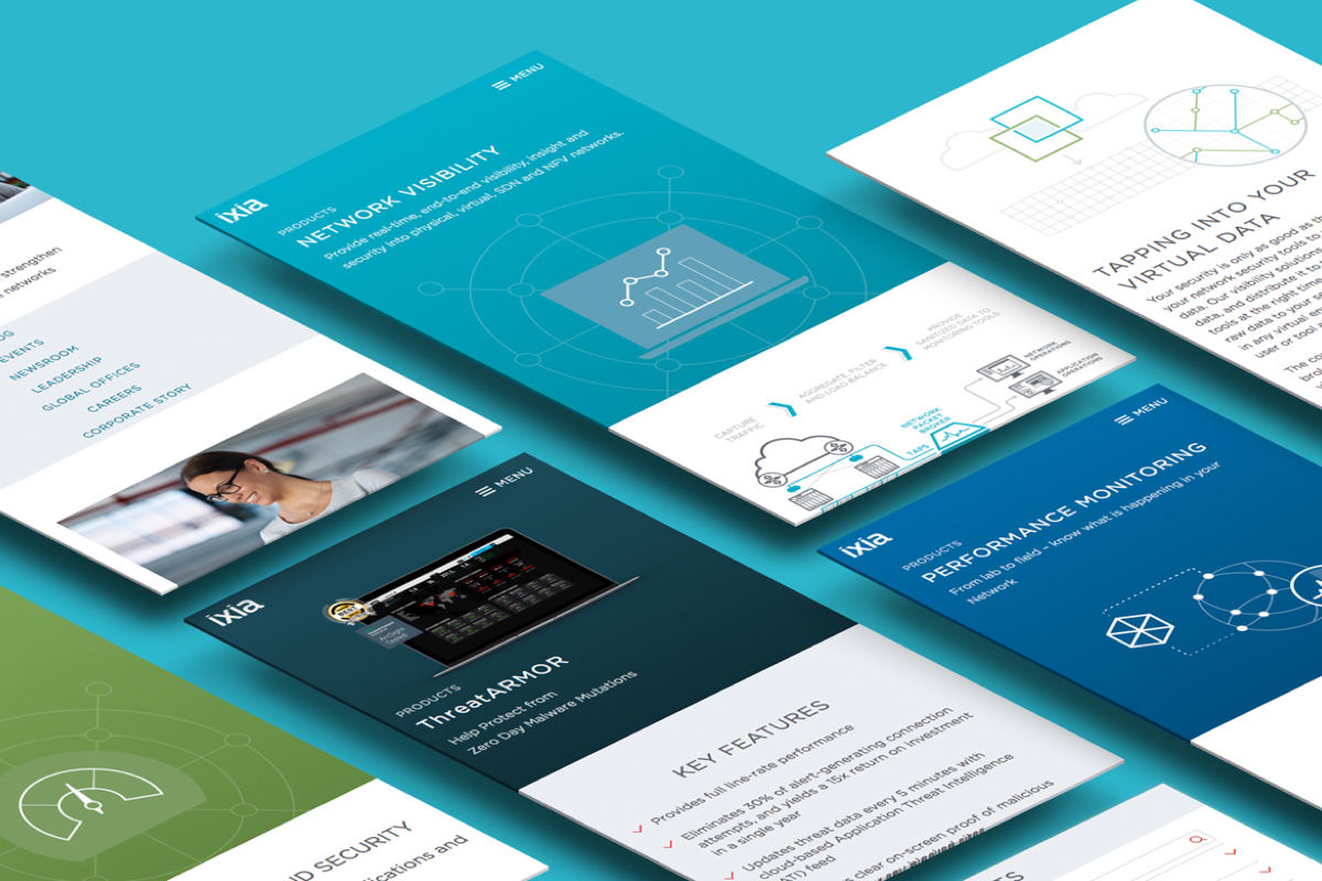
The website is not complex. The main challenge lied in distilling down CKR’s narrative. We cut down content that was too long and wrote content that was missing. I developed a design system that was sophisticated, professional, smart, friendly and fun. This was tricky because some of those attributes oppose one another. After a few false starts, I found the right combination of elements to deliver the intended result.
Neutral elements contrast with splashes of color, layered pieces and occasional shape masks. Generous use of white space give the designs a modern feel and improves the user experience by chunking the content.
Results
CKR has a stronger brand that better represents who they are and what they do. The website is still in development. To see the full design comps, click here.
Services
Strategy
Content strategy
Information architecture
User experience design
Brand design
Illustration
Copy editing
I completed this work while I was the Art Director at CKR Interactive. The work was done in collaboration with Brandon Spencer, Jeff Pritchard and Samantha Busch.


