CooperVision
39 websites, 24 languages, 1 design

I worked with CooperVision for 5 years. During that time, my team designed a website that functioned as the template for 39 country sites, translated into 24 languages. We improved their site through multiple iterations. This is that story.
The beginning
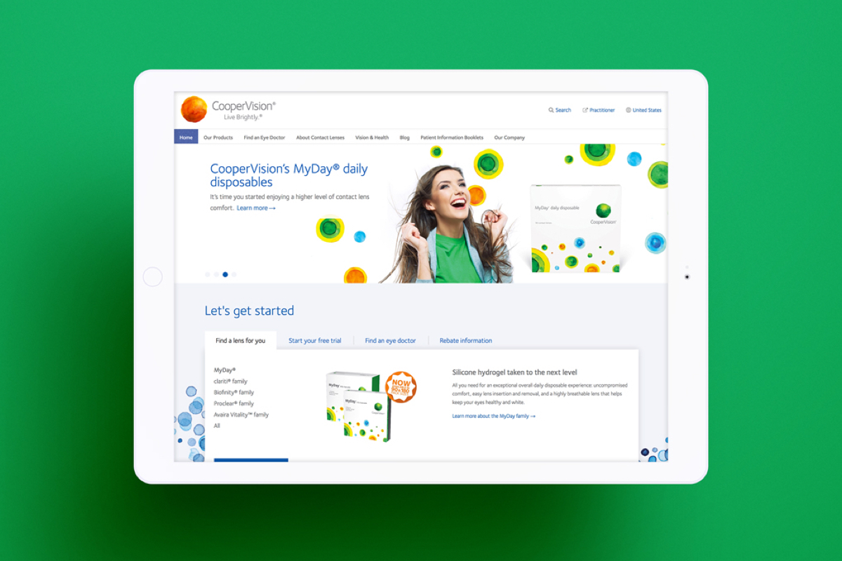
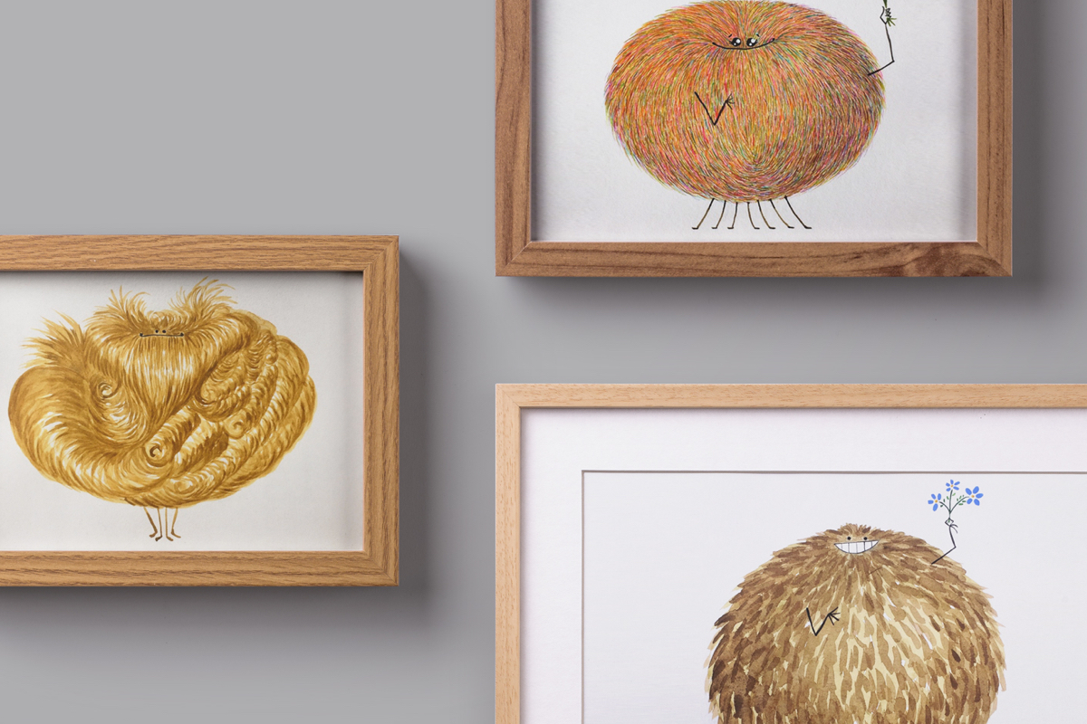
CooperVision rebranded in 2010. They redesigned their logo, color palette, typography and value proposition. They had a rich library of watercolor illustrations and assets, but struggled to translate those elements into a functioning website. They approached my team to help.

Strategy
I facilitated a process that defined their new digital strategy, balancing the needs of their customers and the needs of their content creators. We identified key tasks customers wanted to do on the site, and through that lens refined the information architecture.

Content structure and visual design
Next we created structures for the multiple templates. We designed flexible components to highlight promotions, feature calls to action and showcase new products.
We extended the brand, creating new design elements to support the site structure. For example, we adapted the watercolor motif to add color and texture to the primary navigation. We also commissioned new watercolor illustrations to visually connect the elements of the page.

We designed the product pages to allow marketing teams to customize their promotions by country with a flexible hero carousel. Calls to action featured prominently on the right with the ability to add additional custom content per product.

Each CooperVision site was actually two sites in one: a consumer site and a practitioner site. Visitors could navigate between the two by clicking on a link in the utility navigation. To reinforce which site they were on, the primary navigation colors were changed. The consumer site used rainbow tabs while the practitioner site used blue tints.

Phase 2
Over time, making their website display better on mobile and tablet devices (also known as responsive design) became a top priority. We used this opportunity to do a thorough refresh.
Designing for mobile
Research revealed that most of the site was functioning effectively for the business. This meant we didn't have to reimagine everything. We focused our efforts on creating a site that would not break when scaled to different screen sizes.
Challenges
- Country sites had varying amounts of content (navigation items, products, blogs etc.). We needed a design that would work for the least and most amount of content.
- Some languages had longer character counts. We needed to design systems that wouldn't break with longer words, but still looked balanced with shorter words.
- Marketing teams requested more layout options for content. We had to design and build new options.
Navigation solution
Our first task was to design a navigation solution that looked balanced on large monitors as well as mobile devices. It also needed to accommodate longer character counts for languages such as German, without breaking the layout.
For desktop, we widened the navigation bar to 1600 pixels. This gave the links more room to breath at larger sizes. We removed the multi-colored tabs to save space between the links.

For smaller screen sizes, we design a fly–out menu. This menu included additional elements such as search, calls to action, the language toggle and the link between the consumer and practitioner site.
New components
We designed a new secondary promotion area to feature products, promotions, and calls to action. This component displays 1, 2, 3, or 4 tabs, solving the issue of content variability across sites. Countries needing to show more content have 4 sections to leverage while other countries can use the first tab which displays product families. The image below shows the responsive reflow behavior of this component.

New tools for the site authors
Marketing teams requested ways to create more unique layouts. We designed a template that gave site authors the means to create multi-column layouts and stylized components such as quotes and link lists.
All of these components could house video, imagery or animated gifs. The content is managed through a customized WYSIWYG. We created documentation like this image below to help site authors connect the visual design with the WYSIWYG buttons in the back end.

We designed full width templates with multi-column layouts. This gave teams more visually engaging ways to entice visitors to dive deeper into the site.
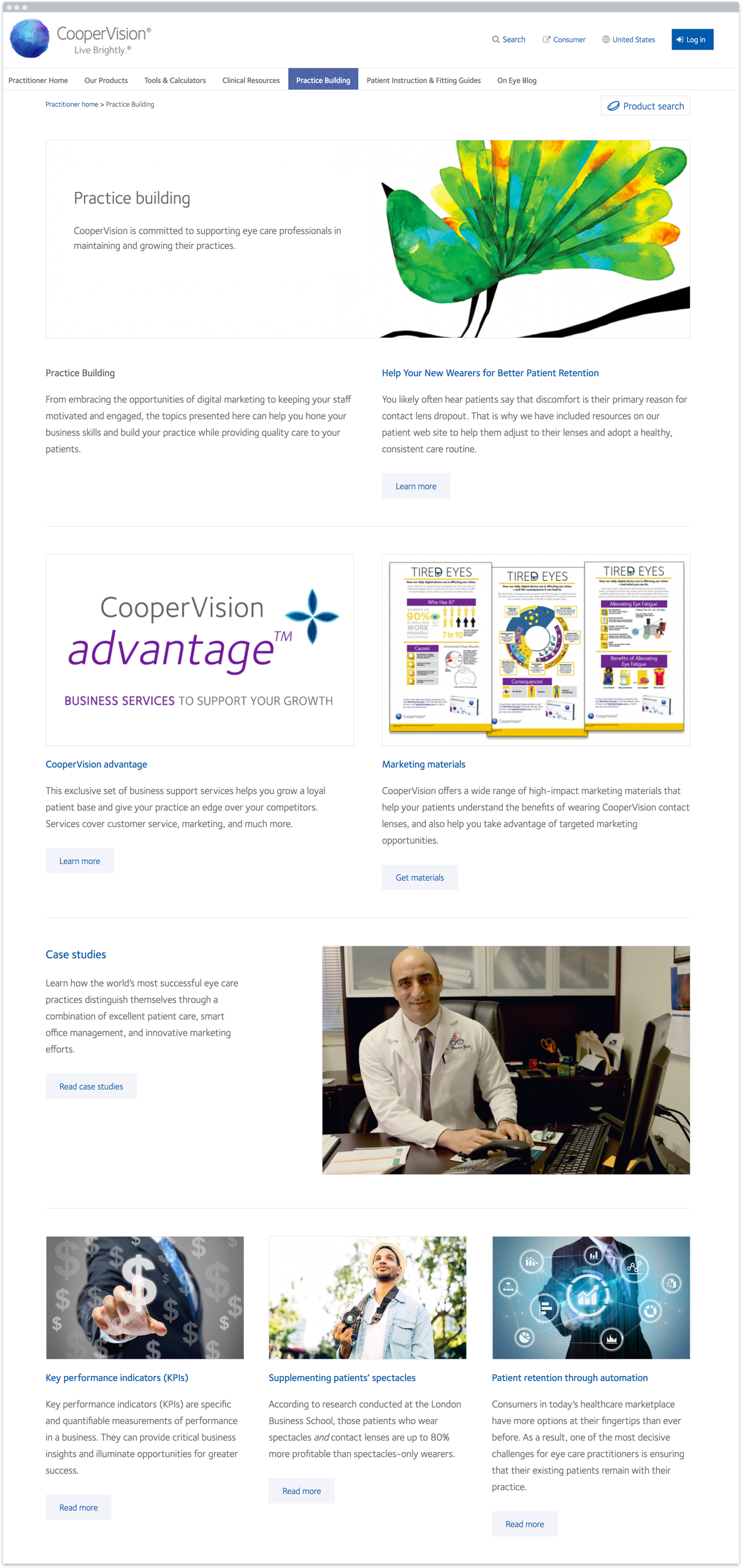
A new practitioner site
We gave the practitioner site a facelift, featuring more tools and content to help optometrists run their practices.

The most important new tool we designed was a contact lens search tool. This allowed doctors to search for a lens based on a wide range of technical parameters.

Results
CooperVision maintains a unified global presence across 39 countries. Each site is customized to it's specific market. The company has continued to increase in value since 2010.
Services
- Strategy
- Content strategy
- Information architecture
- User experience design
- Responsive design
- Digital brand extension
- Training
This site was built with Drupal at Chapter Three and in collaboration with Garret Voorhees.

"Nica did an amazing job helping CooperVision with its global web strategy. She facilitated workshops, researched international requirements, and delivered design templates flexible enough to serve 39 responsive country sites. The sites have succeeded in supporting the business and communication objectives, providing the foundation of CooperVision's digital presence world wide.
Nica is collaborative and pleasant to work with. She is really good at putting complicated concepts into plain English and showing the client how the site would work."
– Catherine Muriel / VP Digital strategy
See more work