Chapter Three
The story of a brand

In 2009, Chapter Three hired me to be their Creative Director. My job was to build the creative services offerings of the company. In addition to doing client work, I maintained and evolved the Chapter Three brand. This is the story of what that looked like.
Chapter Three 2.0
When I joined, Chapter Three possessed the following brand collateral: a logo, an existing website with rich blog content, a tagline and 2 illustrations.


Chapter Three 3.0
We needed to create a new site that reflected the strength of the business. While the company was only 3 years old with 8 employees, it was a leader in its field. The three owners were early adopters of Drupal and had grown to be some of the most respected contributors in the space. For that reason, we prominently featured our team on the home page. At the time, our team's expertise was our biggest competitive advantage.
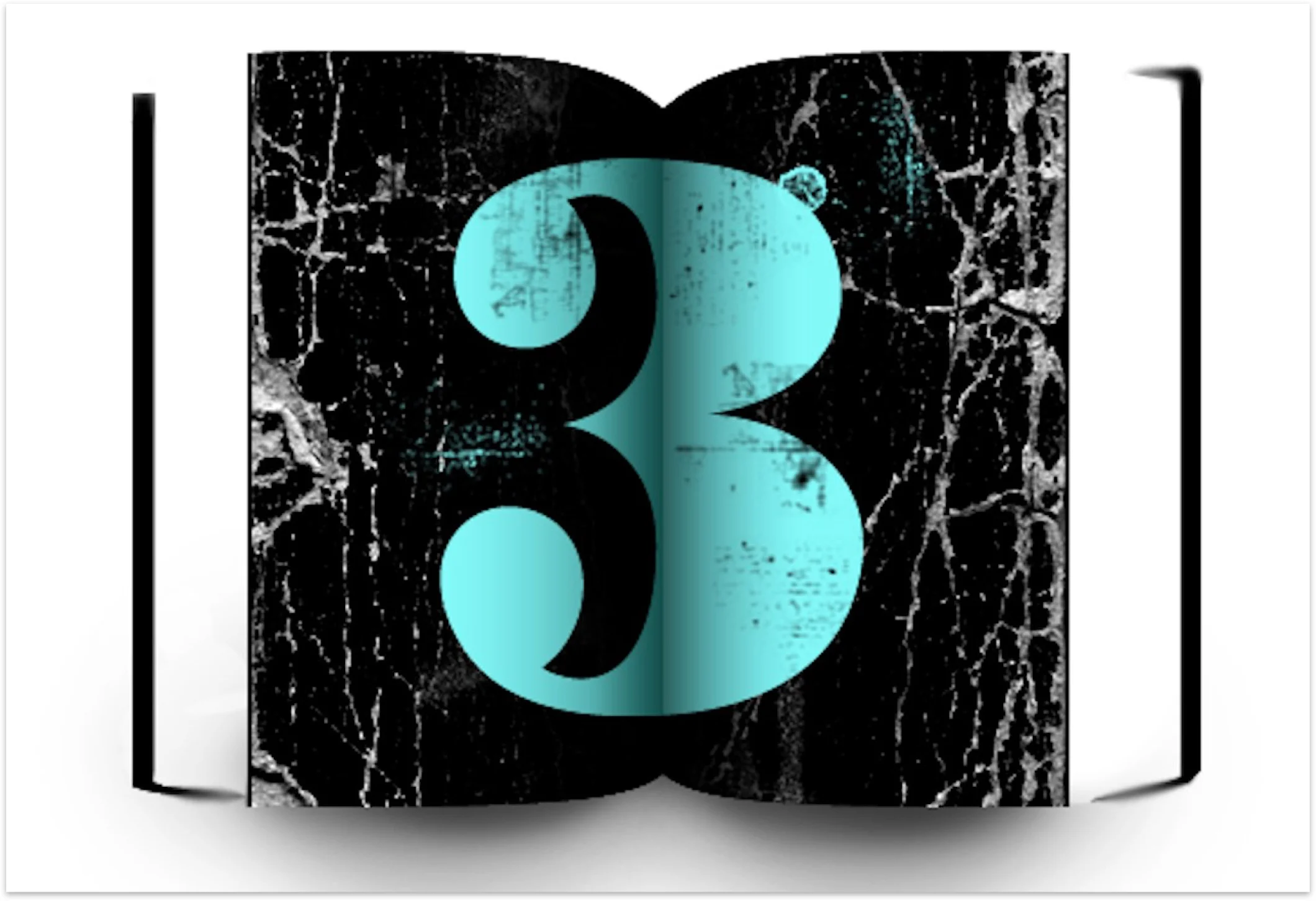
I designed a new look and feel that harmonized better with the logo, using teal as the primary brand color.
We created a new tagline, "Your Drupal Experts in San Francisco." We strategized that location was a key differentiator for clients who preferred to collaborate in person. This strategy still holds true today, and the tagline has not changed. It's also not bad for SEO ;).

To accompany the website redesign, we created new shirts. We sourced the shirt material to reflect the distressed tone of the logo.

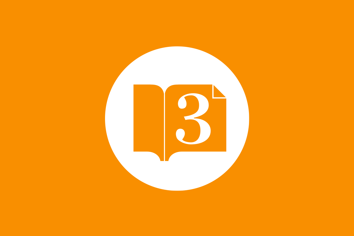
Chapter Three 4.0
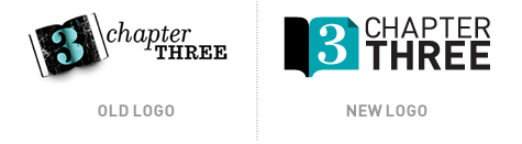
As the company grew from 8 to 24 people, we evolved the brand to reflect the company's new capabilities. The first change was a logo update. We had outgrown the scrappy start up phase. Our brand needed to maintain its personality, but feel more professional.
A new book icon was created with flat colors. This allowed the icon to look good at any size. A new type lock up with sans serif font was both stronger and easier to read.
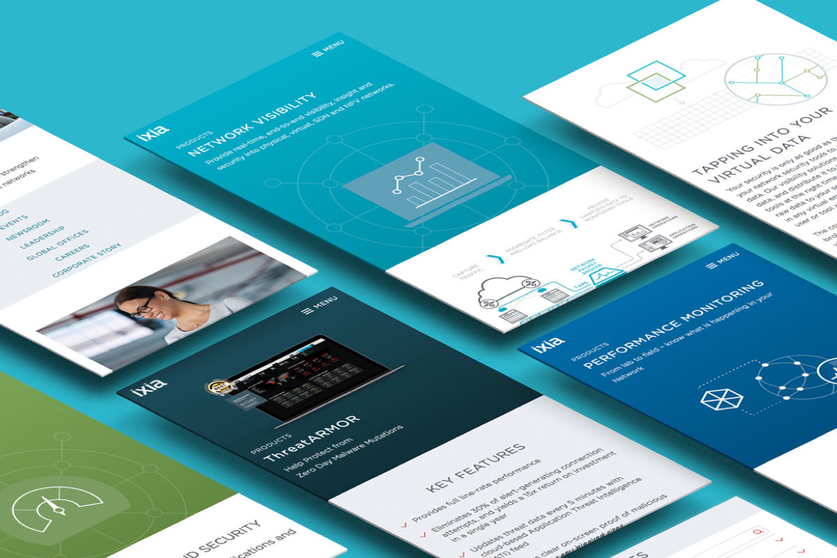
The new site design was balanced, bold and clear, with horizontal lines pulling your eye down the grid of the page. This version of the site introduced orange as a new brand color.

A graphic element in the footer was added to explain the story behind the company name. This conveyed personality and answered a question many of our clients asked.
We printed new collateral to leverage the flexibility of the new logo in different mediums.
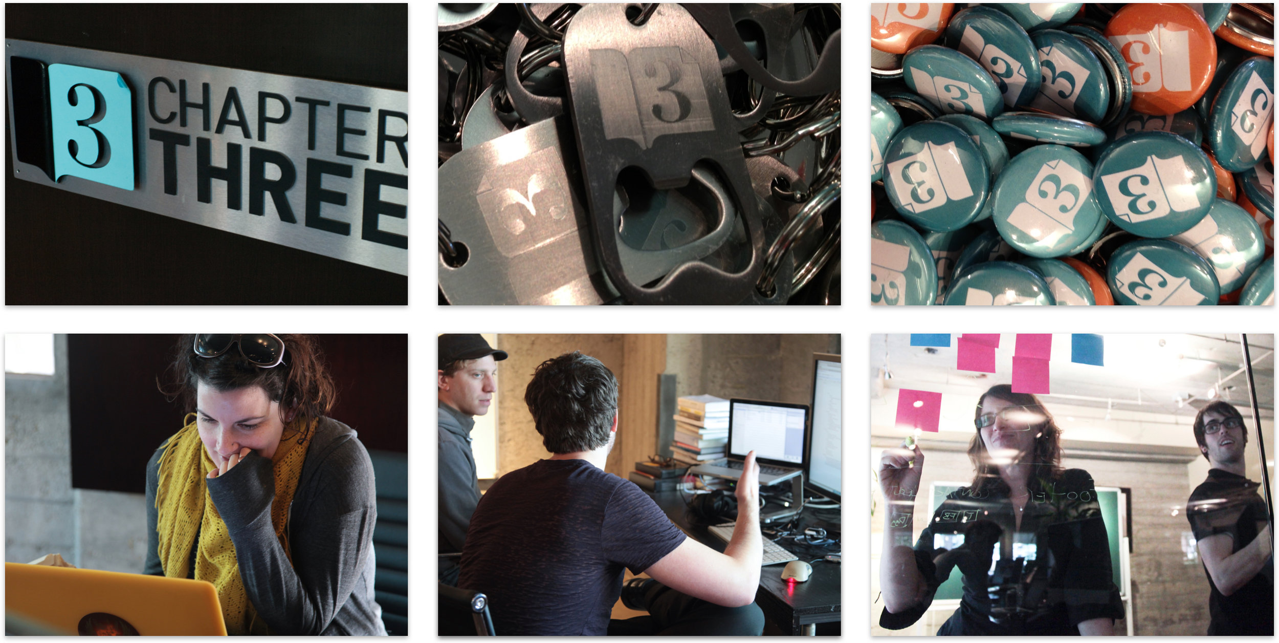
We hired a professional photographer to capture our team in action. This provided us with richer visual assets to tell our company story to potential clients..

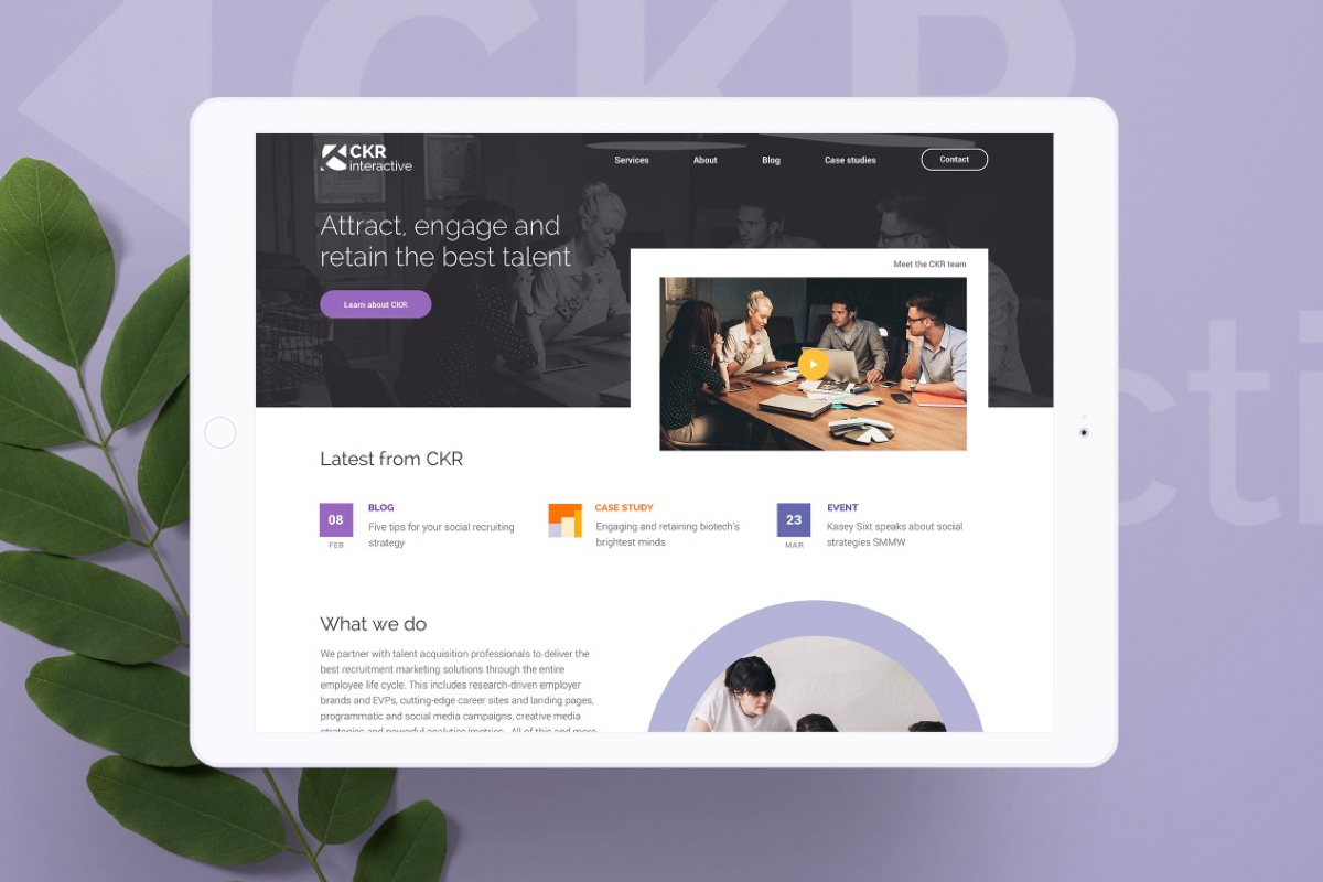
Chapter Three 5.0
The next brand refresh was catalyzed by the need to make our site responsive. We used the opportunity to dive deep and ask ourselves who we were and who we wanted to be.
I conducted research to gain a baseline understanding of how brand was currently being seen in the world. We then created a list of attributes we wanted to cultivate and devised a plan to get there.

For example, We knew that to improve the perception of our design expertise our site must embody the highest quality of design at all levels. We also knew that to maintain and improve our thought leadership we had to allocate resources towards speaking at conferences and blogging.
Another deep dive task was the distillation of our company values. Following the lead of companies like Google, I thought it would be useful as an exercise to clarify who we we were and what we stood for.
The values became an enduring set of concepts that:
- Informed our company culture
- Drove business decisions
- Influenced resource allocation
- Became the foundation of the brand
- Motivated and inspired the team
These ideas took root and transformed the company for the better. Values were shared with new employees when hired. Potential clients heard these ideas in sales meetings as differentiators that made our team unique. They fostered a culture of learning and collaboration. It's one of the things I'm most proud of when looking back at everything I did for Chapter Three. They were and continue to be transformative.

As we worked on content for the redesign, my team created brand voice guidelines. This helped writers create content that was more consistent and reflective of the brand.

We updated our logo once again. We lightened the colors and sourced a different typeface, to match the new typeface of the site.

We designed a second logo with no icon. This helped our new design look super clean and modern.

Our new home page was a stunning video of San Francisco with a looping video of fog rolling across the Golden Gate bridge.

Our About page reinforced our location with another aspirational image of the fog and the Golden Gate Bridge. Our key message echoed one of our company values: to build a better internet.

Our Drupal Give page highlighted our thought leadership contributions to the Drupal project.

We took a minimalist approach on the blog by simplifying the display. This removed all distractions from the reader so they could focus on the content.

We sourced aspirational photographs of San Francisco to reinforce our location within the Bay Area. Location remained a key differentiator for clients who wanted to collaborate in person.
We used candid photos of our team in natural light with shallow depth of field as hero images for the Services, Training and Career pages.

We created new design patterns for our case studies. Each case study received a unique design that was more visually engaging. Content was broken up into chunks so a reader could easily scan the story.


We created a special page to talk about Drupal 8. As an early adopter, we positioned ourselves as a leader by sharing our completed Drupal 8 projects and code contributions.

We updated our business cards to reflect our new branding. We removed design elements to make the layout more simple and clean. Each person received cards with multiple colored backs. This created a colorful display when we displayed our cards at conferences.


For our ten year anniversary, we created some unique materials to celebrate. We wanted to design something that was fun and different, but that still felt like it was part of the brand. We began with a seal illustration, creating a simple stylized version of the Golden Gate Bridge and the Drupal logo.

We extended that design direction for our conference print materials. We added gradients and introduced pink and purple into the palette. By maintaining some of the original palette and typography, this felt like an extension without feeling totally separate from the brand. We briefly made this design our home page, complete with animated star twinkles during Drupalcon 2016.


All of the work shown here was a team effort. Floor van de Velde, Garret Voorhees, Darius Garza, and Kirsten Sims all contributed. I led the team, providing Creative Direction and design.
The story of the Chapter Three brand represents the deepest investment I have ever made in a design project. Our company grew and thrived during my time there. I feel fortunate to have been given the opportunity to manage such a great brand.
See more work